❋
D&D Nite
Print Design, Digital Design
2026
Tools
Illustrator
Skills
Layout, Illustration, Branding
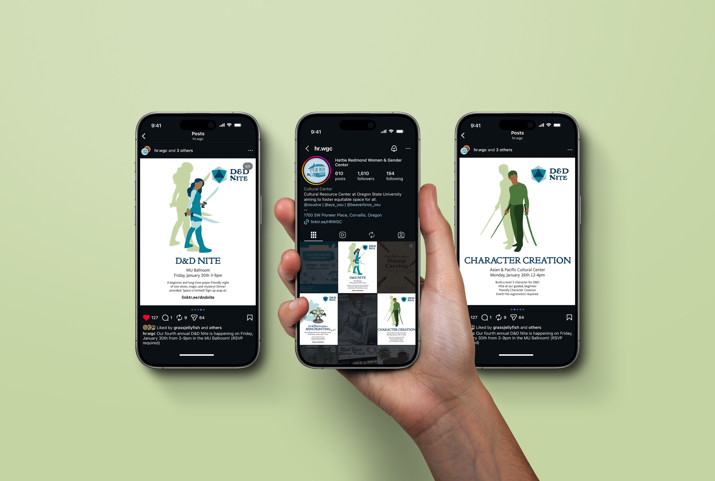
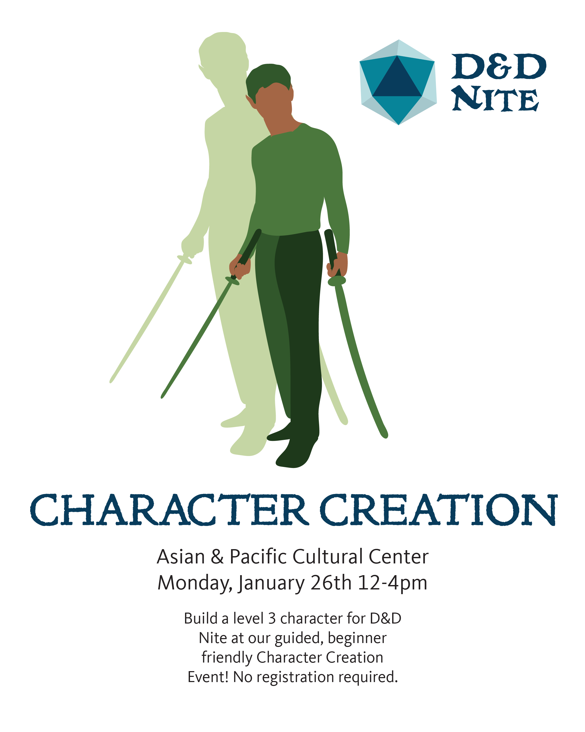
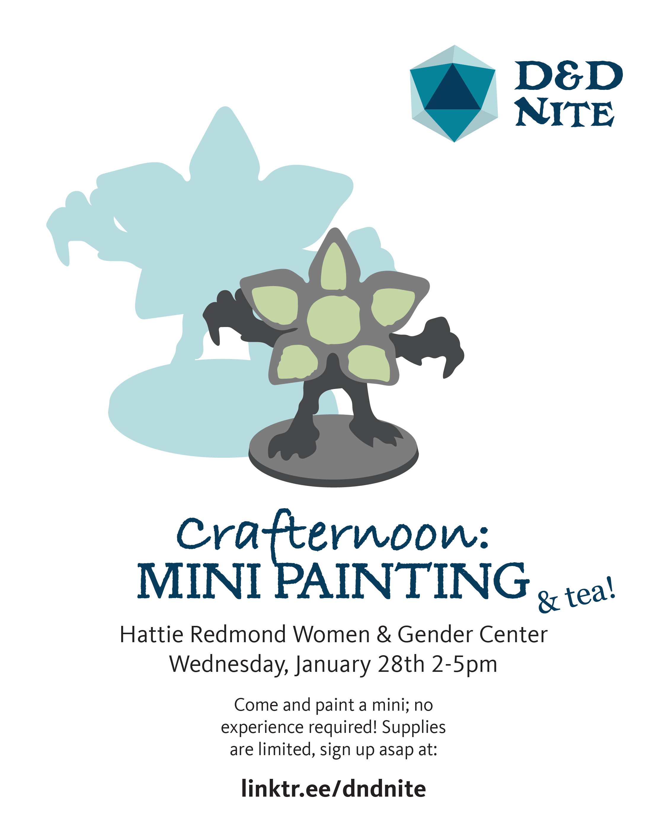
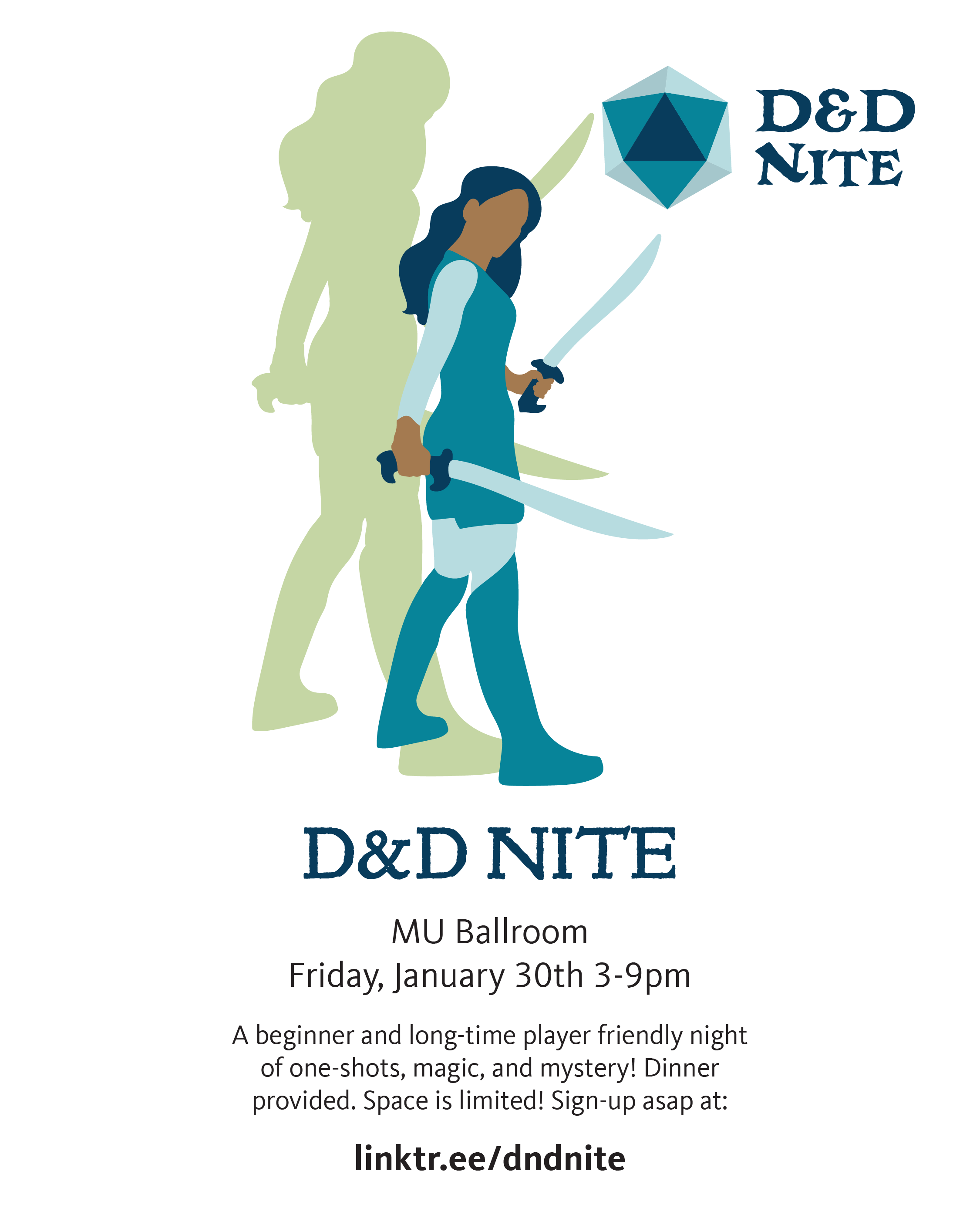
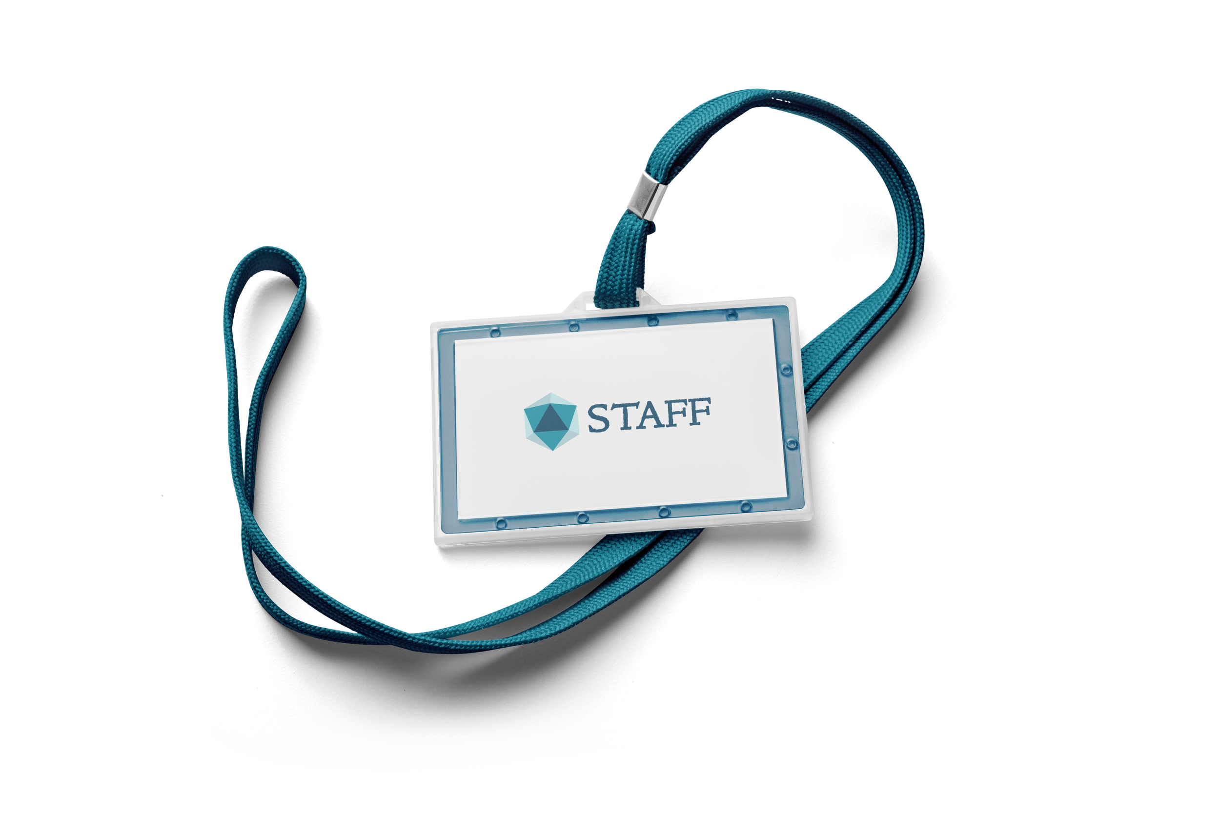
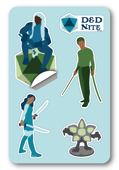
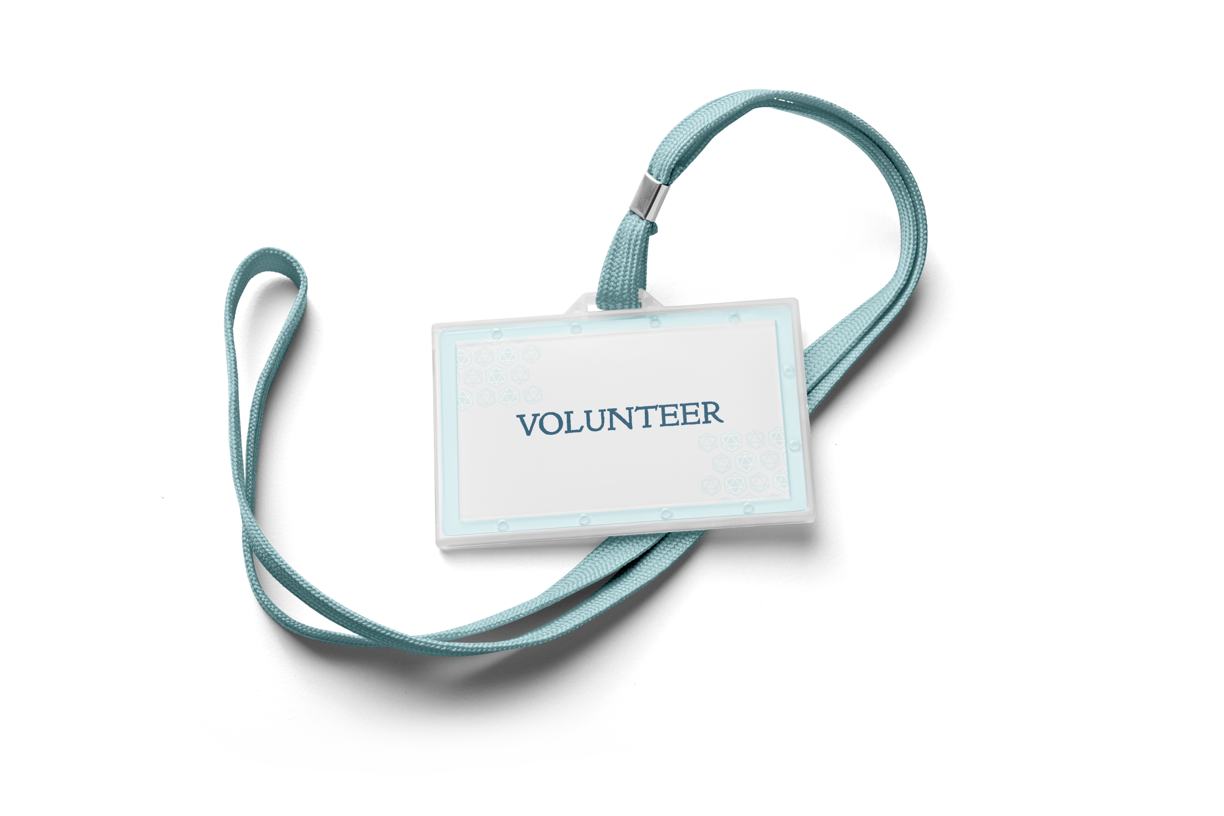
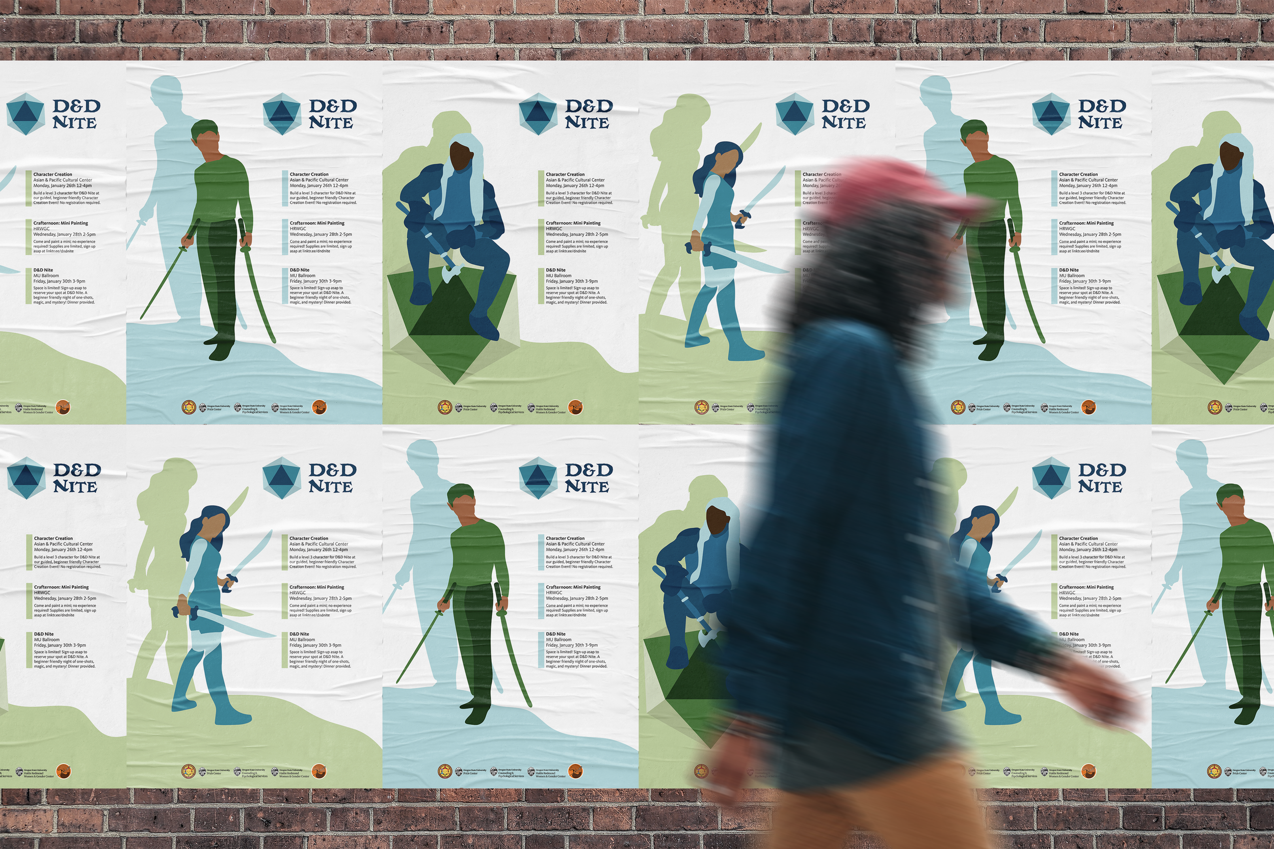
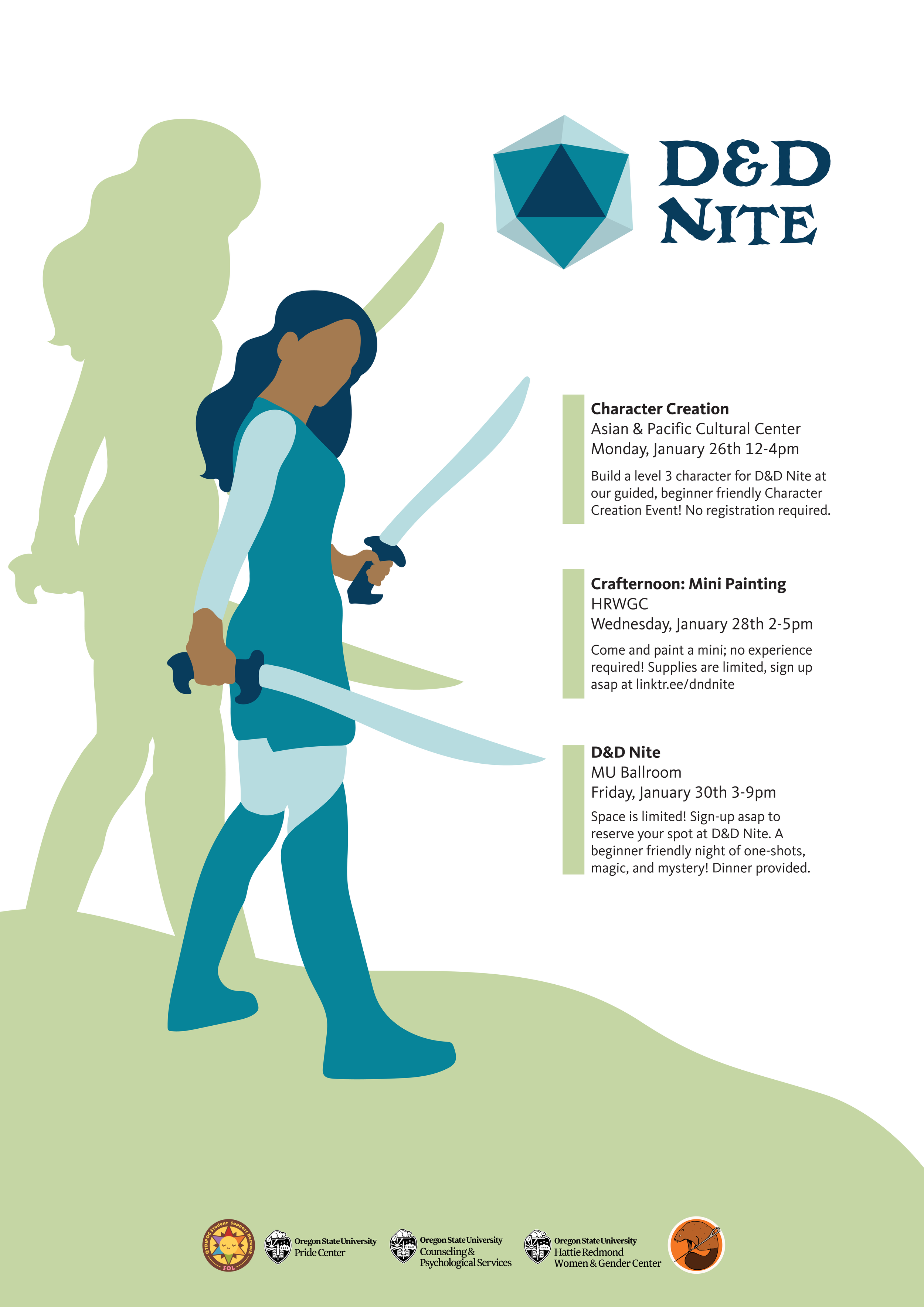
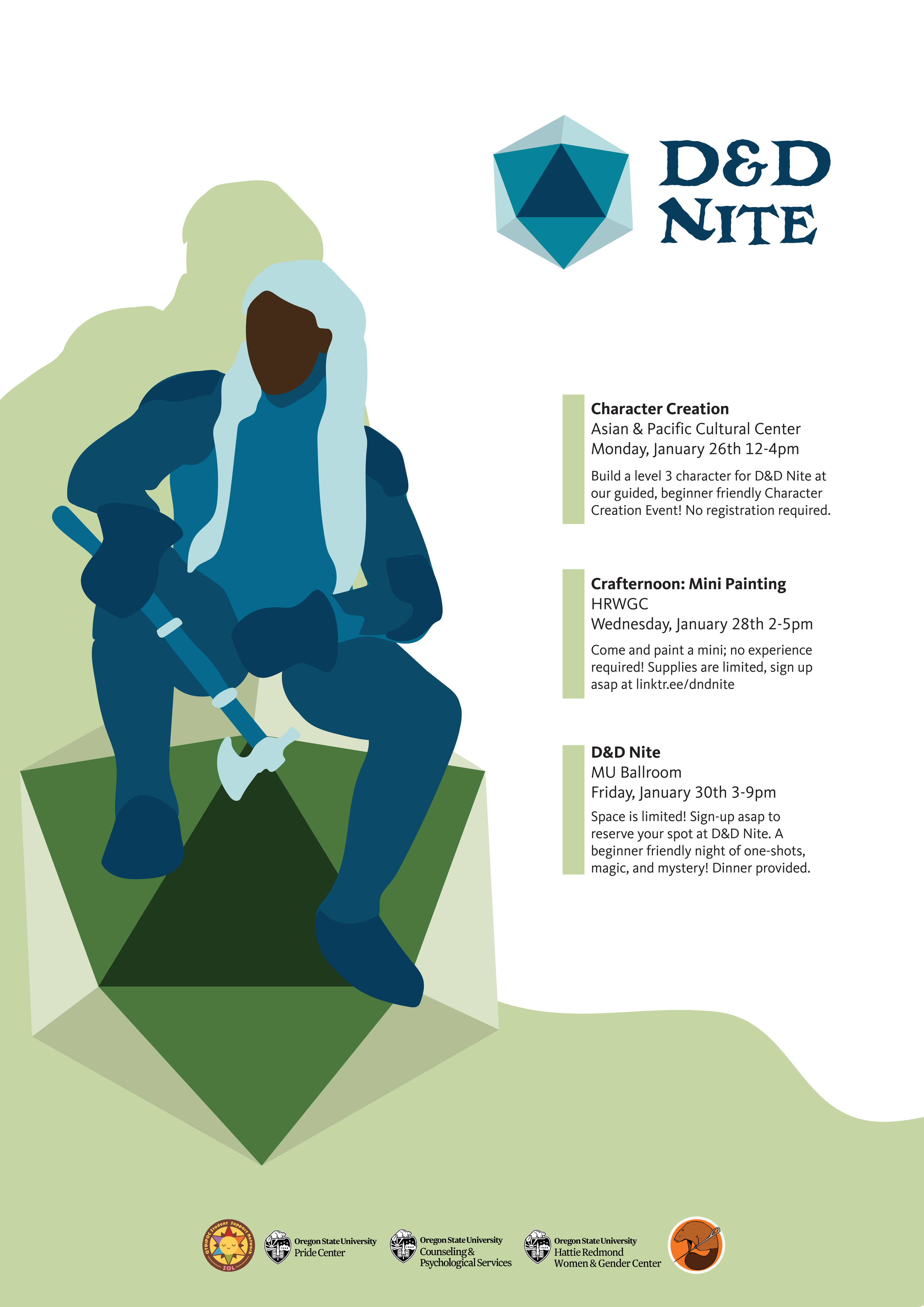
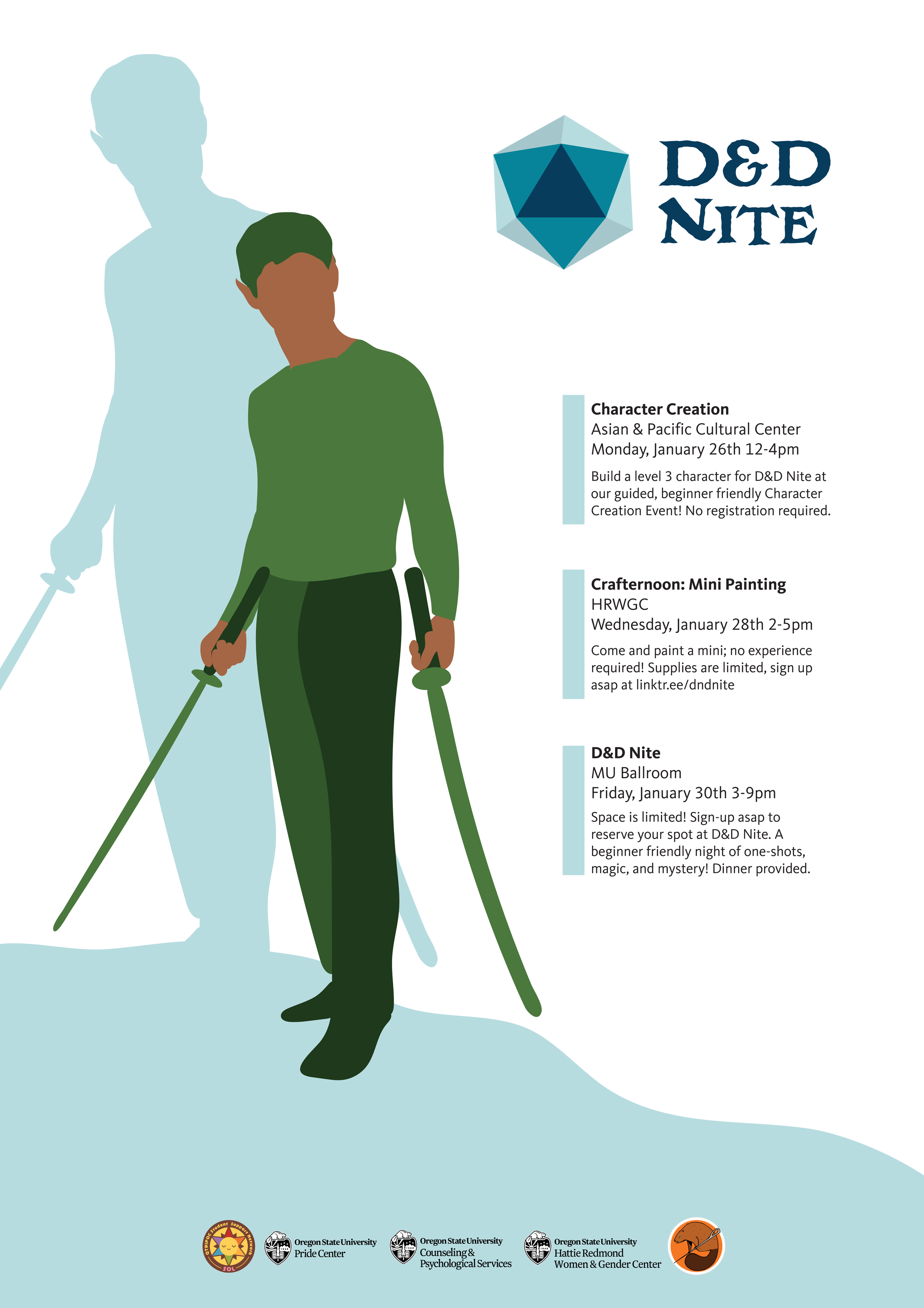
For this project, I created branding, promotions, and tchotchkes for a week-long series of events called D&D Nite for the Hattie Redmond Women & Gender Center at Oregon State University.
D&D Nite’s mission is to provide a safe and inclusive gaming space, especially for identities who are not always made to feel welcome in those spaces.
My directive was to create promotions that subtly nodded to the inclusive nature of the event, read as D&D related through both images and text, and aligned both with Oregon State University requirements and Hattie Redmond Women and Gender Center colors.
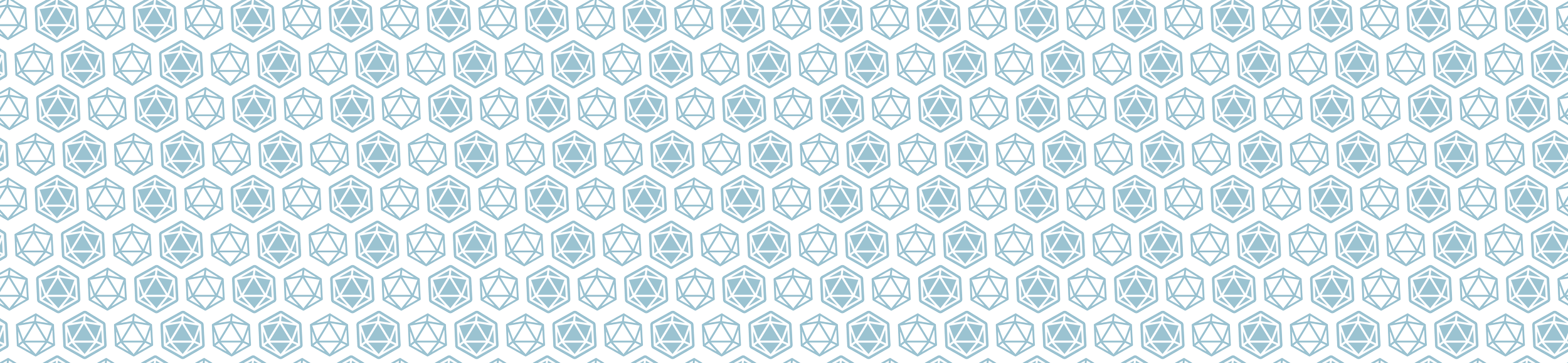
I centered my designs around three illustrations inclusive of a variety of skin tones and gender expressions, all in action/fantasy related poses.
FONTS
I utilized Masonic Lodge for the wordmark; it has a fantasy, hand-etched feel that lends itself well to the often medieval or otherwise fantastic settings of Dungeons and Dragons.
For headers, I used Kievit Office Bold, and for body copy, Kievit Office Regular. This clean lineal is unobtrusive and extremely clear. Importantly, key information is easy to read and digest.
COLORS
D&D Nite colors are friendly blues and greens — not only are these welcoming, natural colors that speak to both adventure and community, but they also connect to the Hattie Redmond Women & Gender Center’s pre-existing programming.
Blues are pulled from the “little blue house” the center is physically located in, and the green’s are inspired by the fern symbology employed by one of the big initiatives they house — their AYA Women of Color initiative.