
❋
Living Proof
Print Design
2025
Tools
Illustrator
Skills
Illustration, Art Direction
"Living Proof: Health and Climate in the PNW," is a project that came out of 5 interviews with friends and family from the Pacific Northwest on the deeply intertwined topics of health and climate change.
Each illustration is based on a conversation between myself and my interviewee on the ways rising heat from climate change has created and/or exasperated mental or physical health challenges.
My hope with these illustrations is to draw a line between climate change and human health. I feel it is a little talked about link.
I created this project as a fellow for the PRAx Art Science Fellowship’s 24-25 cohort.
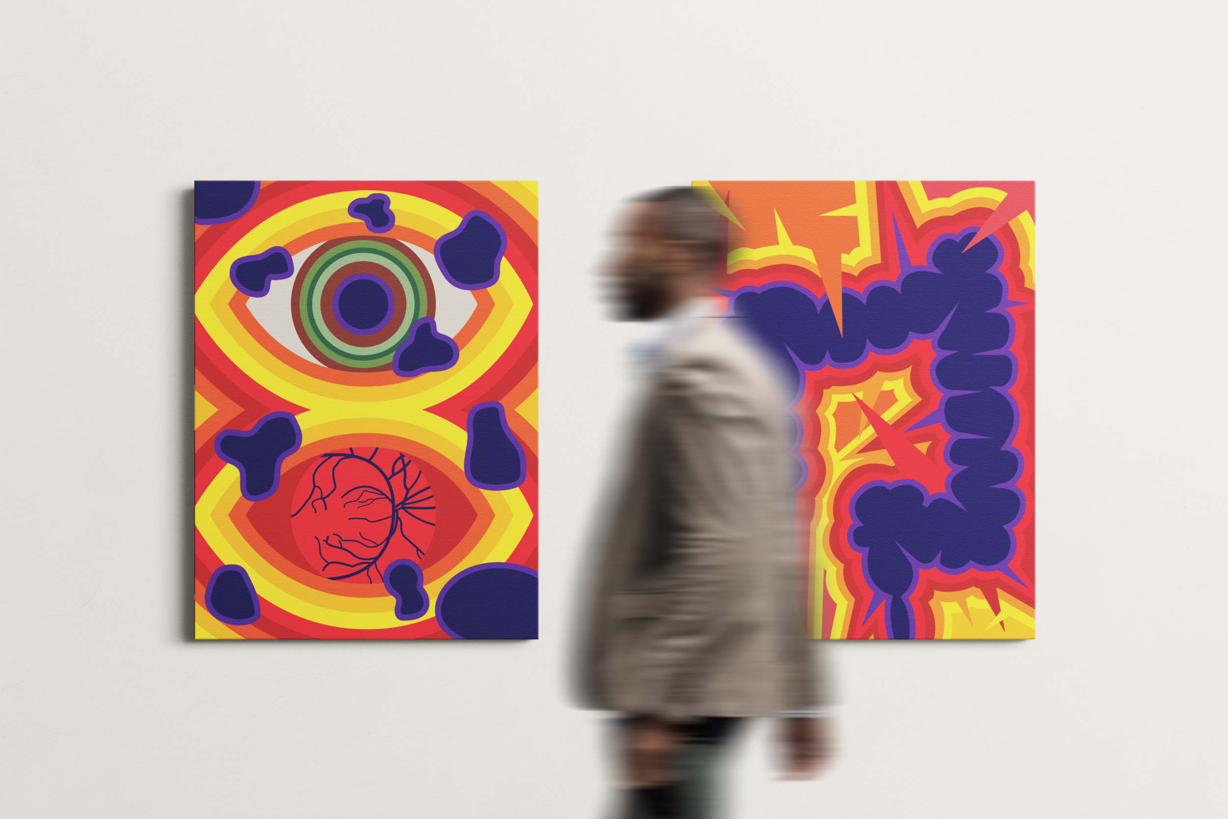
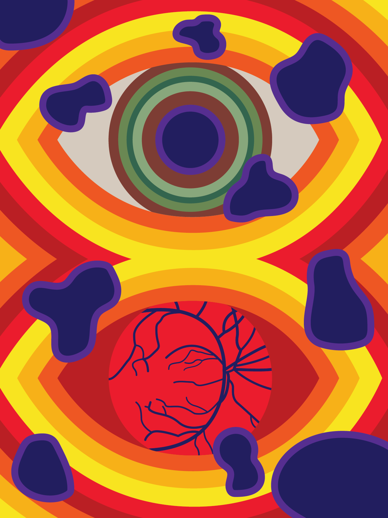
Blind Spots
Chronic Relapsing Inflammatory Optic Neuropathy (CRION)
This is the one that started it all.
In my Junior year of high school, 6 years ago, my Dad passed out in County Cork, Ireland on a work trip.
Before that point, health issues had never been a part of my life. I hadn't been to a hospital since the day I was born. I don't know if I'd ever seen anyone collapse outside of TV, and I certainly never saw EMTs in person.
I chose this project because I've seen how the rising heat impacts my Dad. In my sustainability coursework, I've gravitated towards health-related issues with climate change, and read about what this is doing to us. It concerns me, and interests me.
My hope with these posters is to draw a line between climate change and human health. I feel it's a little talked about link.
Secondarily, maybe some of you will see yourself, a friend, or a family member in these pieces. I hope that my works make my interviewees feel seen, and maybe they can do that for you too.
For this piece, the upper eye reflects my father's hazel eyes, while the lower eye shows the optic nerve with an inflamed, red backdrop.
Purple blotches -- meant to symbolize the blindspots caused by CRION -- envelop the upper iris and obscure parts of the poster. The optic nerve and the center of the blind spots are the same color to draw a link between them.
Expanding yellow, orange, and red lines portray the heat that exacerbates this condition, as well as pain and inflammation.
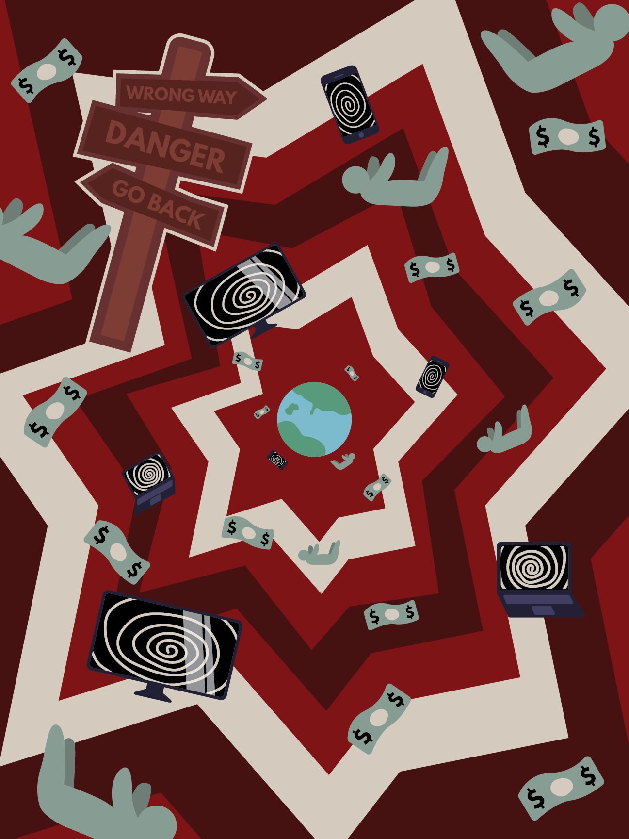
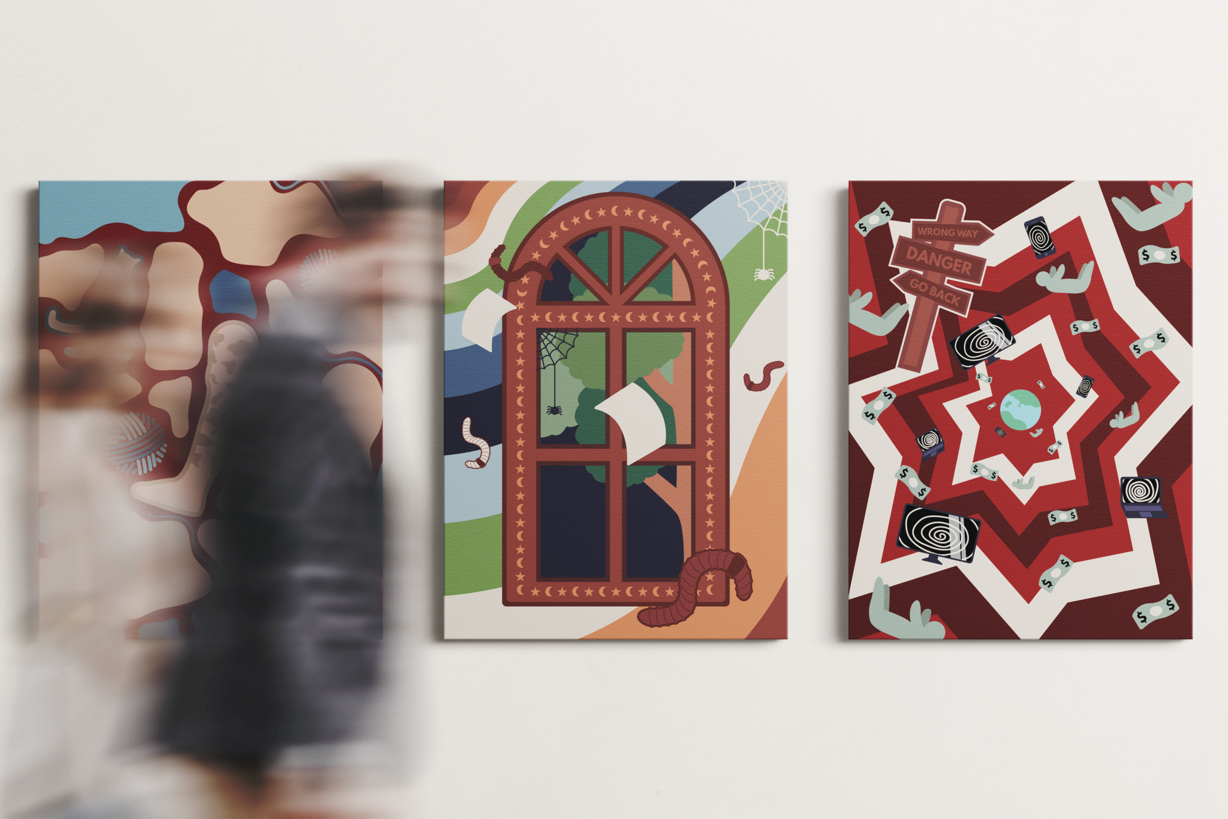
Fear
Climate Anxiety
Action lines reminiscent of comic books expand out as money, people, electronics, and a warning sign ripped from its station hurtle towards the Earth.
This interview brought up a lot of post-apocalyptic scenes that reflected many of my own worst anxieties; Emily and I talked about weather changes, the feeling that there's no way back, and world-ending hellscape scenarios.
A lot of the images that came to mind for me were too complicated to effectively showcase in the art style I had established, so I had to think about how to show anxiety in a more metaphorical way. This brought me back to action lines in comic books as a backdrop.
The electronics with spiraling screens come from our discussion of how her climate anxiety had developed over time, and the part social media and the web overall had played in it.
I think most of my viewers will interpret the money as being about capitalism and greed destroying our planet. That symbol came more specifically from talking about how as consumers we often want to put our money towards more sustainable products, but those are almost always the more expensive choice, which locks people out of that option unless they have the privilege that comes with a higher income.
The wrong way sign was included because of a single conversation snippet: "no way back" which made me think of those crazy signs in looney toons warning bugs bunny or some other character that they better not go any farther.
Lastly, the planet was included to bring all of this anxiety back to the climate. The falling people focus it on the completely out of control, overwhelming, falling feeling anxiety can give.
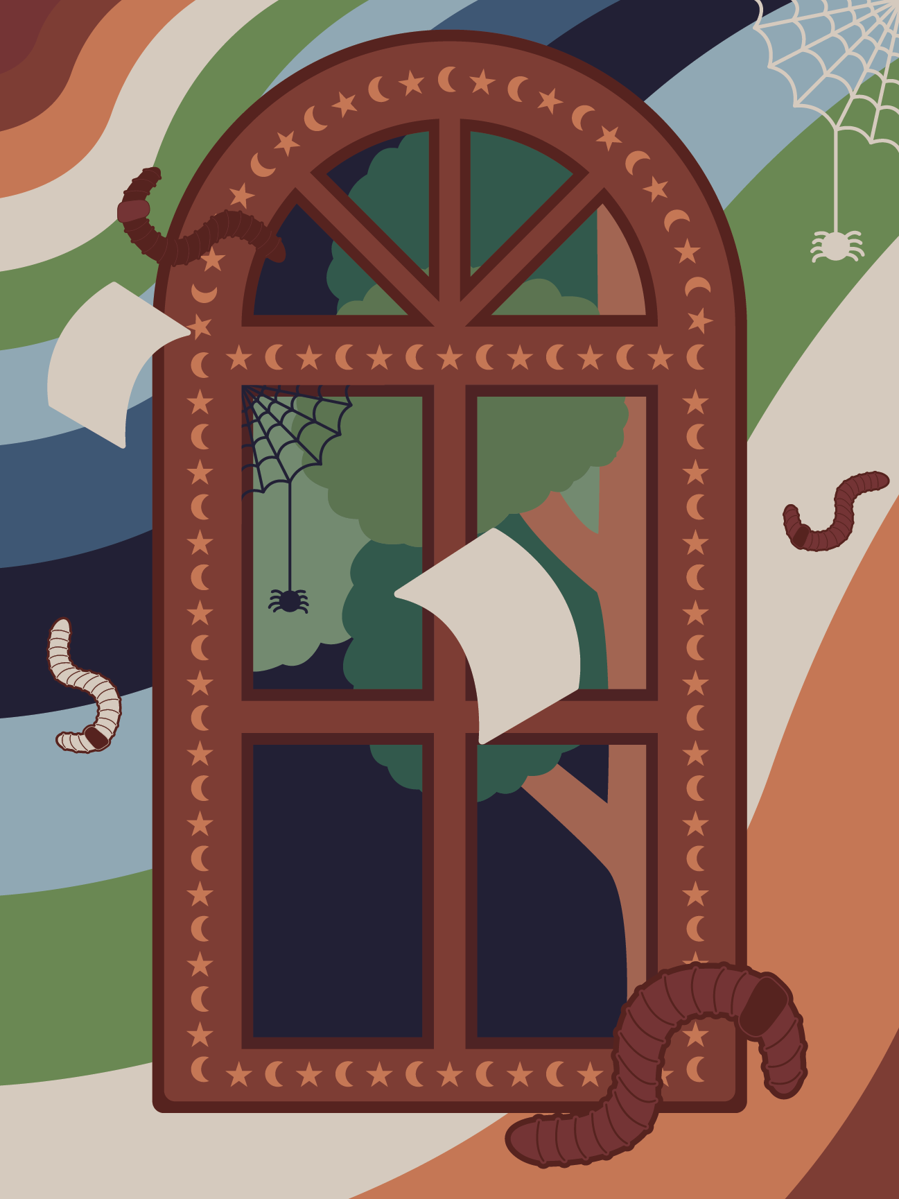
The Window
Insomnia
Wavy lines and flying objects surrounding an out-of-place window create a strange, dreamlike scene. The window is adorned with moons and stars, and through the panes we see a tree at night time.
The tree and window are fictitious versions of a real (now dead) tree that provided shade in Eske's apartment. When it died, the California heat had nothing keeping it from assaulting her apartment, and the insomnia started.
The worms come from a discussion of community compost, while the spiders are a reference to their dwindling presence in her apartment for about a decade.
Earthy tones are important to her life, and something she fills her own space with, so I wanted the poster to reflect that.
She does a lot of dance, yoga, and movement, which is where the wavy lines and falling objects came in. I wanted to create some kind of visual movement in the piece.
Lastly, the pieces of paper came from a childhood memory of the first time she remembers encountering any kind of information about climate change. Her elementary school had handed out leaflets about conserving water and taking shorter showers, which she recalls taking seriously, yet without any real connection to a bigger picture issue. In her recollection, the school never went into the purpose of these actions.
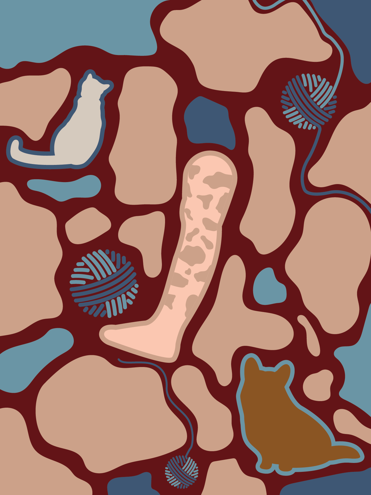
Hot and Cold
Psoriatic Arthritis
In every other conversation I had about a physical health condition, rising heat was a net negative. It causes insomnia, and exacerbates the two other physical conditions these posters cover. However, for psoriatic arthritis, Kailey shared that hot weather makes their joints feel better, yet makes their psoriasis worse.
I struggled with this poster because I wanted to try and reflect those competing ideas. I settled on using a mixture of blue and red to suggest the different impacts of hot and cold weather.
The tan shapes represent the psoriasis itself; I included a leg in the center because thats an area of the body Kailey mentioned having marks left behind from past flare-ups.
Hidden amongst the shapes is one of her cats, and their dog. While not related to their physical health issue, I wanted to include some elements that were important to Kailey as a person.
Lastly, three balls of yarn come undone in gaps between the psoriasis. Crochet is an important part of her life; oftentimes in order to crochet, Kailey wears compression gloves since she has arthritis in her thumb.
Heat Map
Ulcerative Colitis
There was a lot I initially wanted to portray in this piece. Melissa and I talked about ulcerative colitis, climate anxiety, working with children, glaciers, fires, family, etc.
I wanted to show a bit of that anxiety, and reflect how her work with children feeds into her everyday interactions and worries with climate change. However, in the end, this poster ended up one of my most direct ones. I realized that while I was chasing all of those symbols, I was leaving behind the health issue I had started with.
I scrapped a full draft and started from zero to create this version.
The shapes and lines both inside and outside the colon are sharp to portray pain. The color palette was designed by pulling from a heat map to borrow those intense contrasting colors.
I made the colon purple to emphasize the heat outside of it, and to create a visual break/focus for the eye to start from.