❋
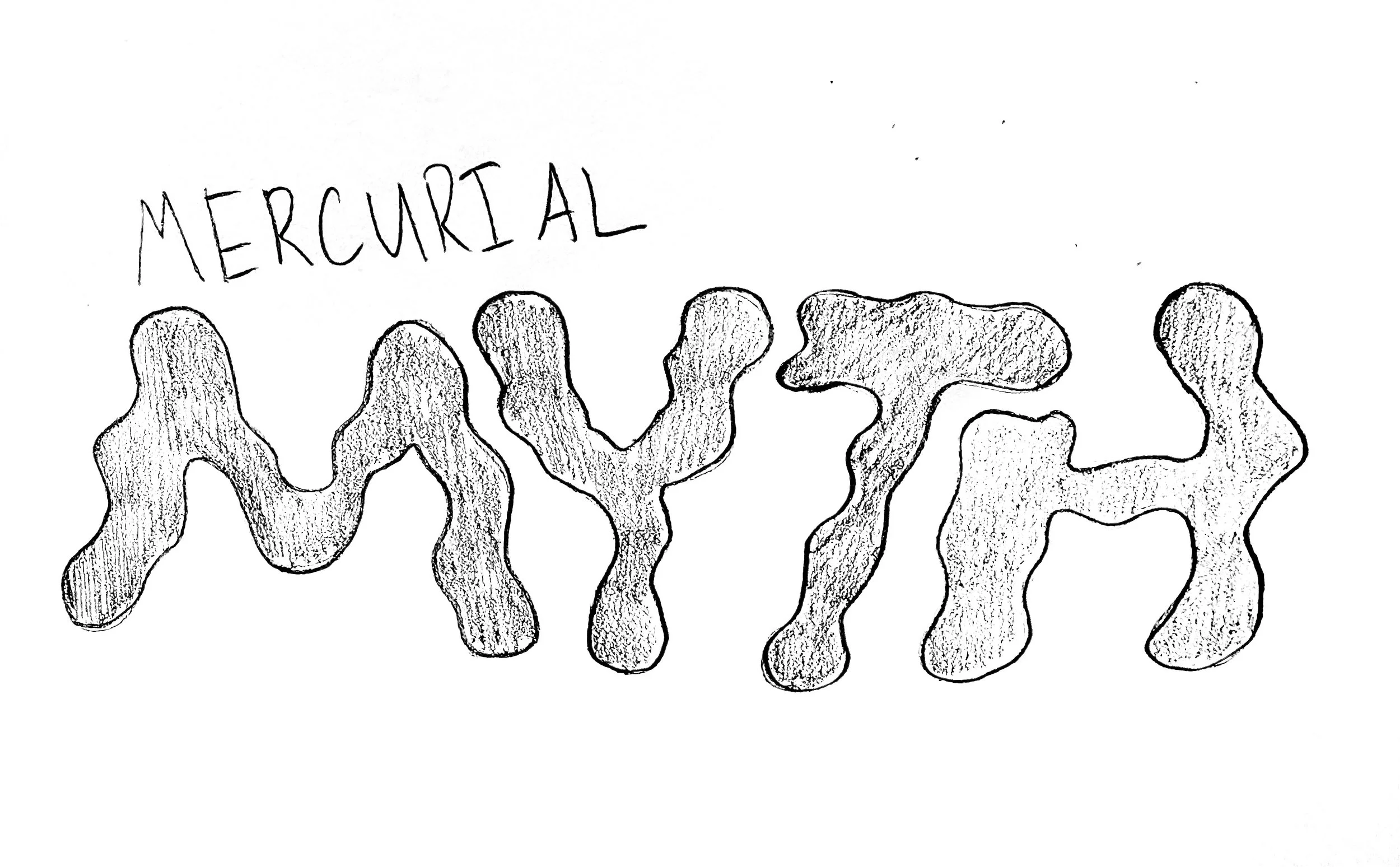
Mercurial Myth
Branding, Packaging Design
2025
Tools
Illustrator
Skills
Illustration, branding, typography
I developed a branding system for the fictional hot sauce brand “Mercurial Myth” that plays off of its name, using imagery reminiscent and referential to Greek mythology.
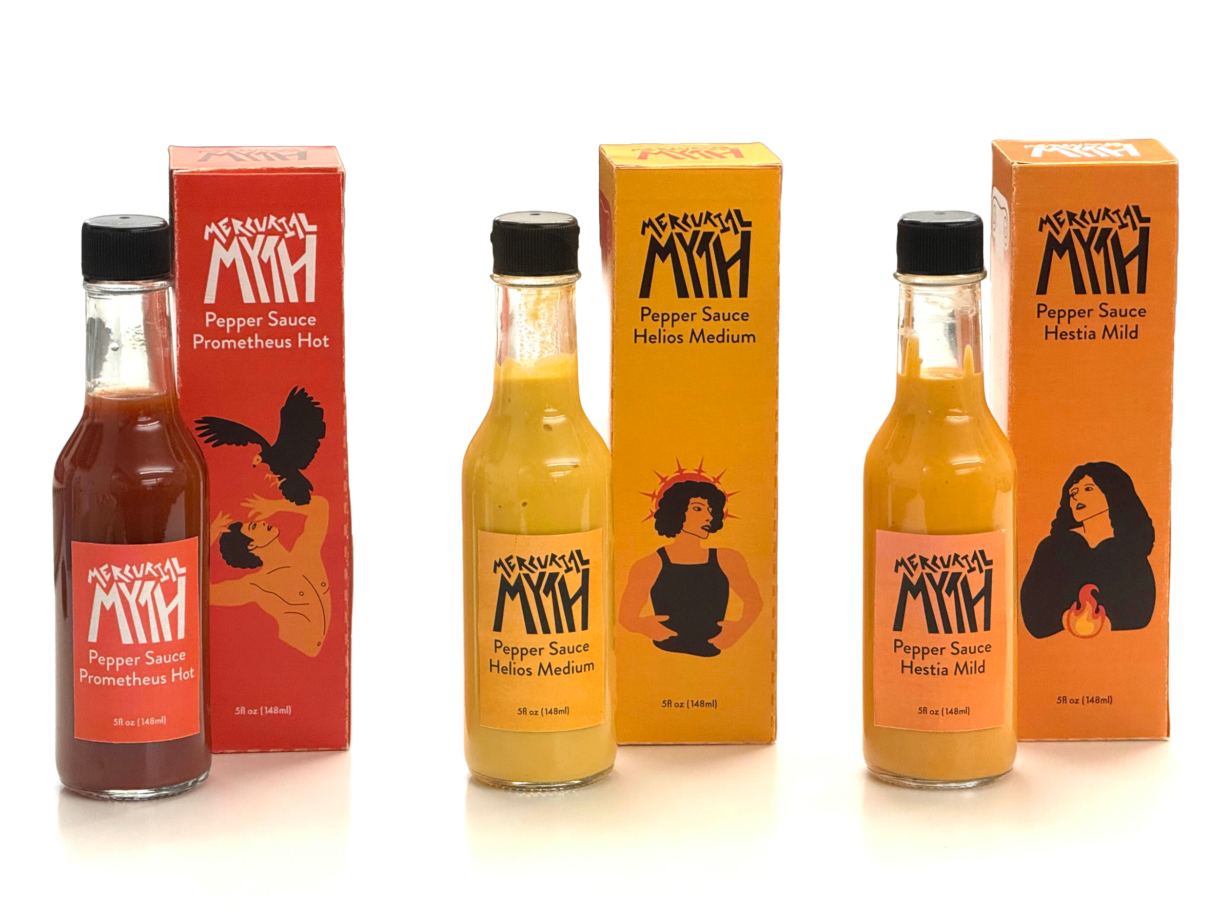
For this project, I created a wordmark, color system, tone, typography, and illustration style. Ultimately, I designed three hot sauce labels and packaging.
Process
〰️
Process 〰️
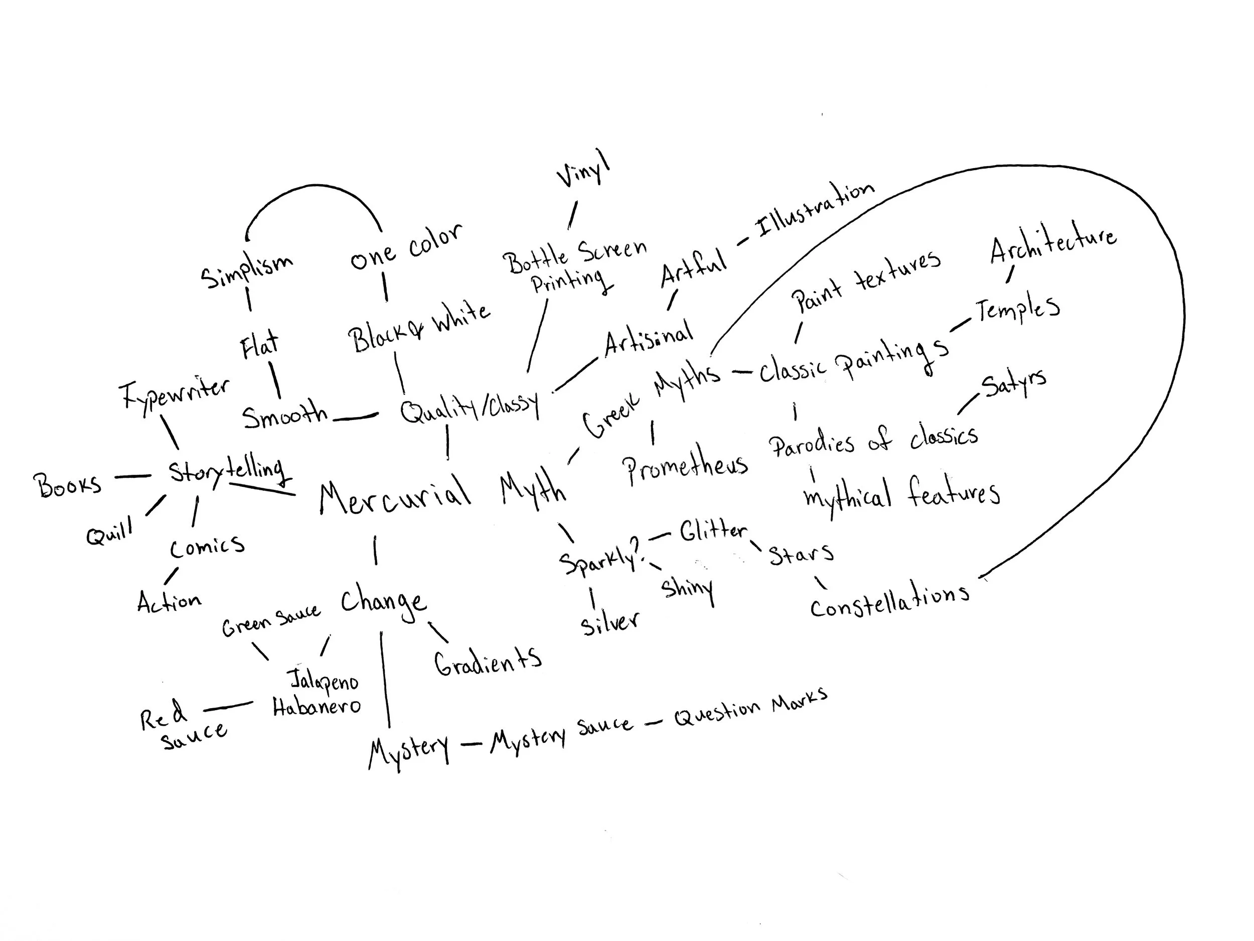
Every good exploration begins with a mind map! I started with the brand name and generated as many related thoughts as possible.
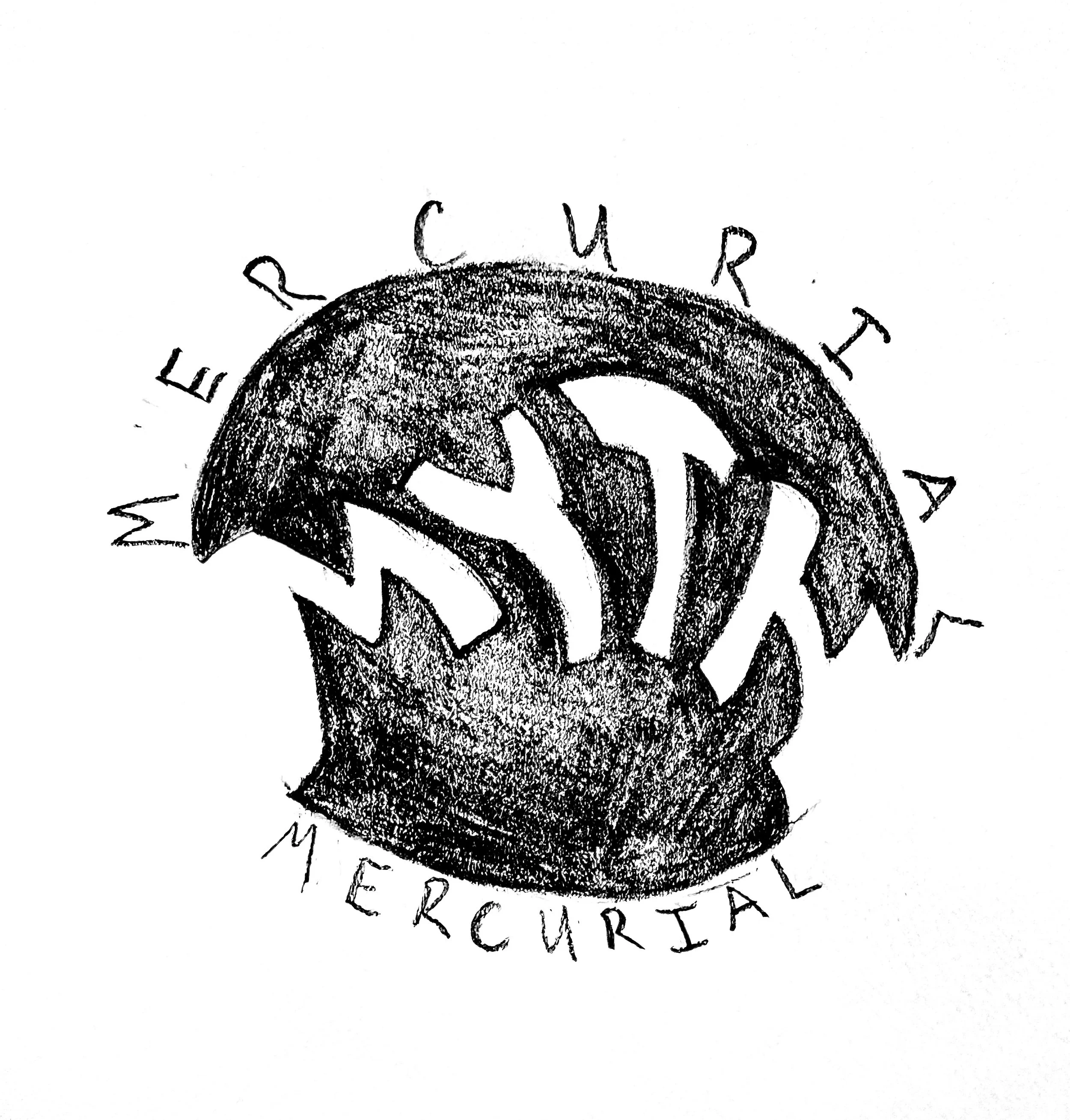
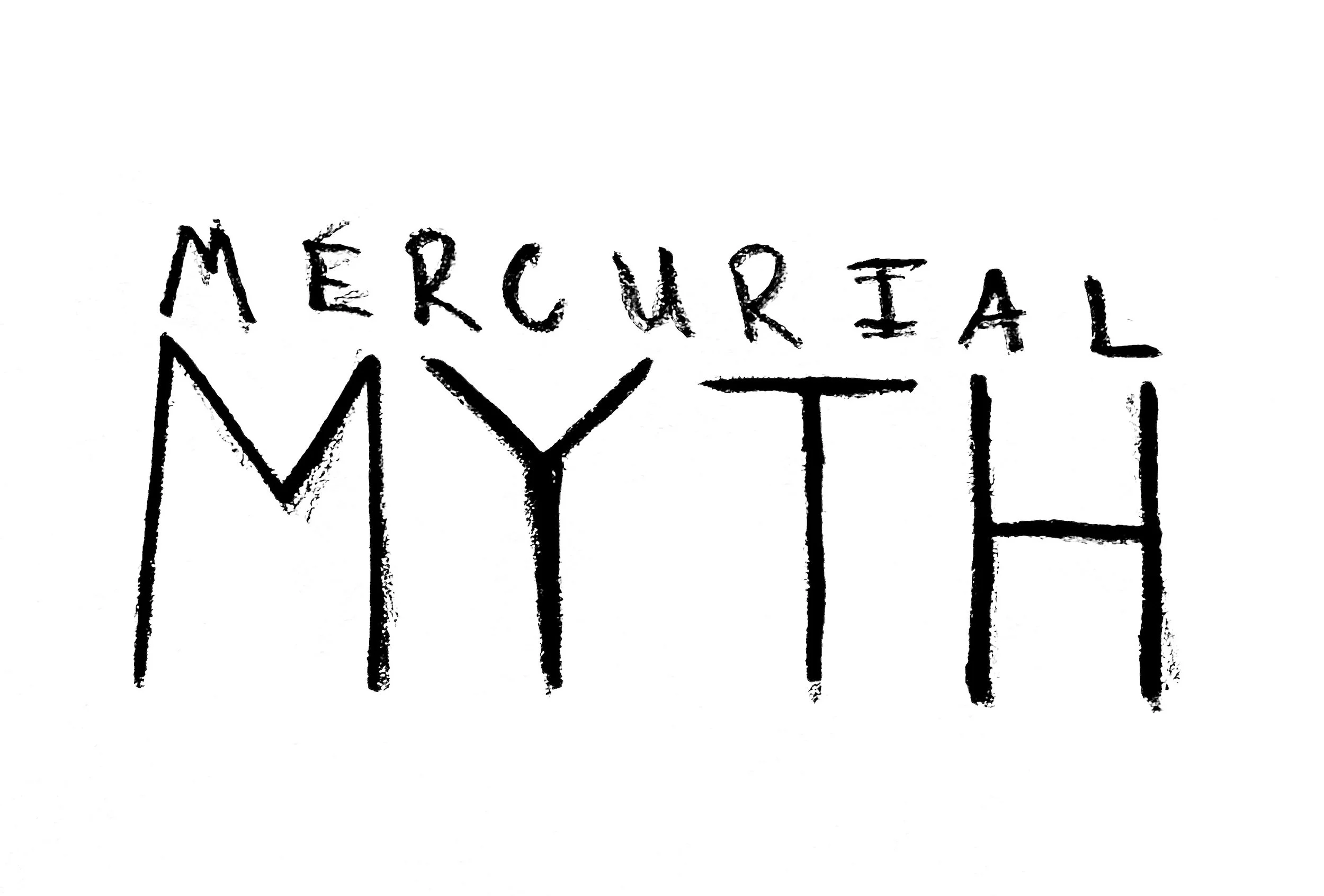
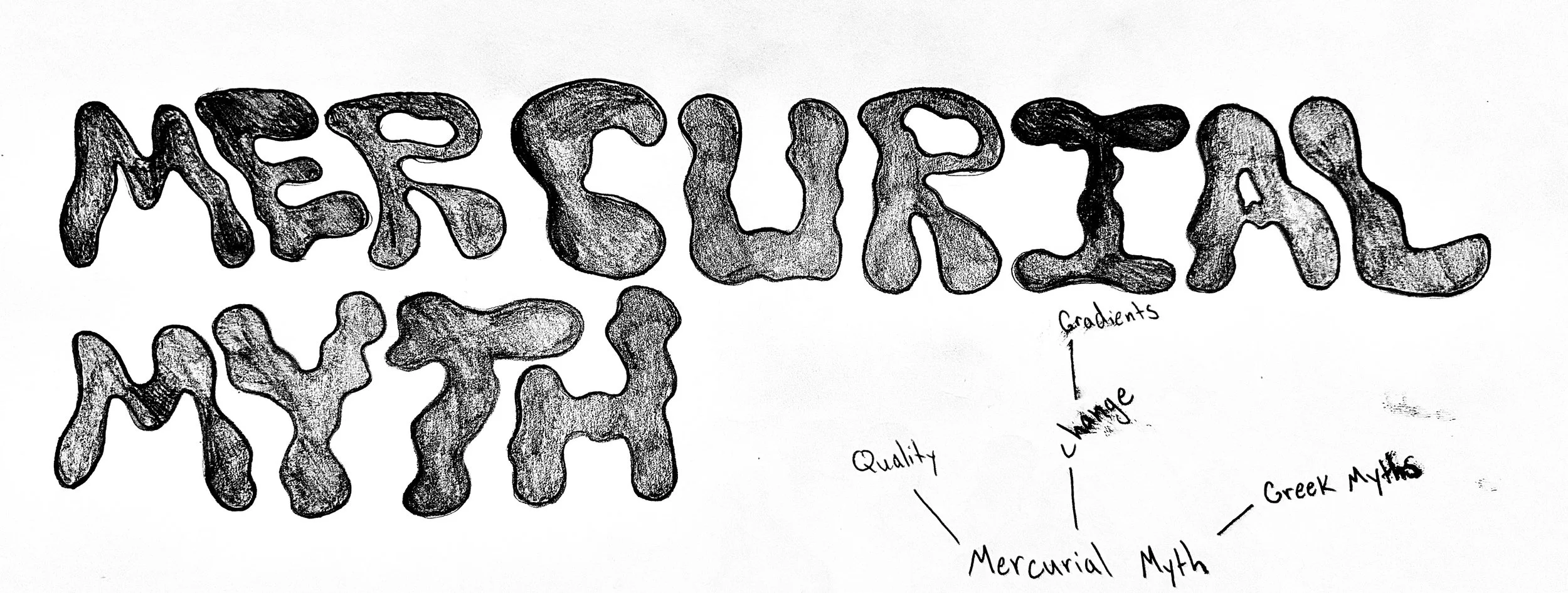
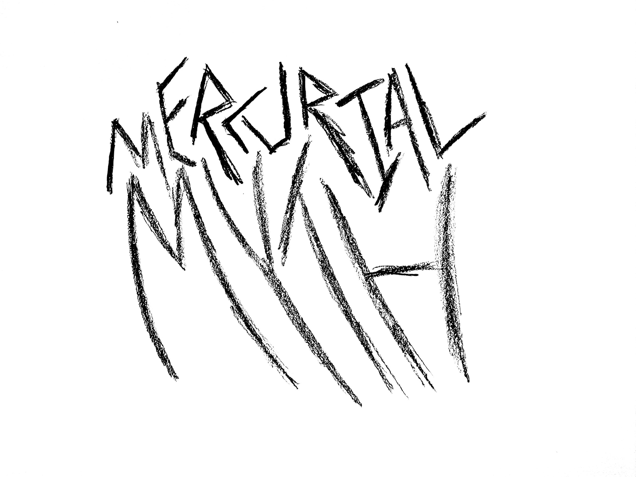
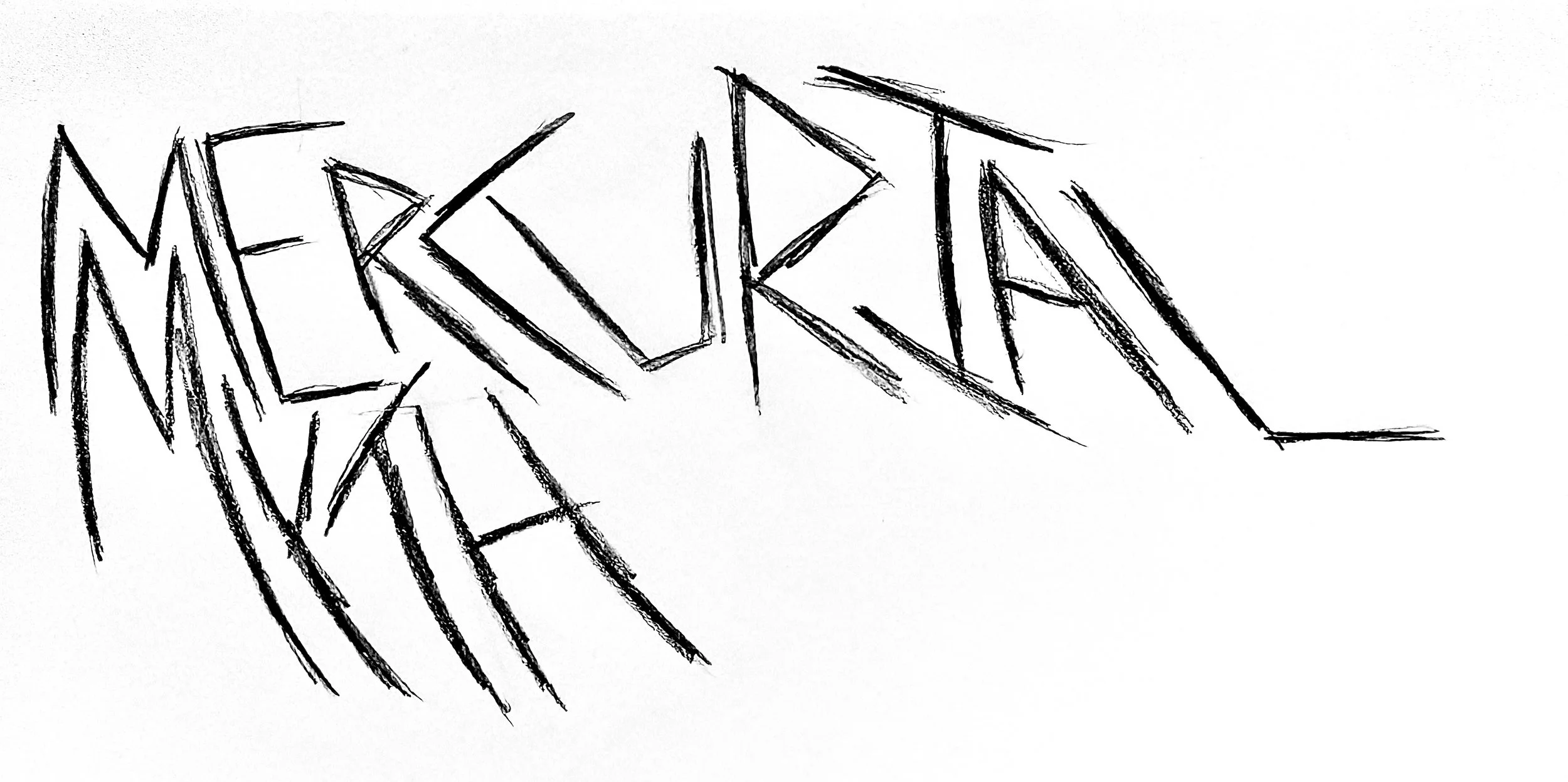
Alongside the mind map, I sketched a few logo ideas, focusing on word marks.
Dielines
〰️
Dielines 〰️
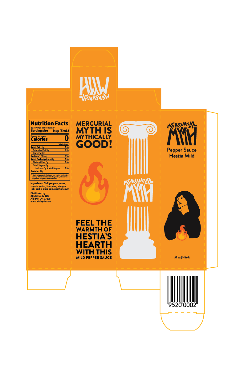
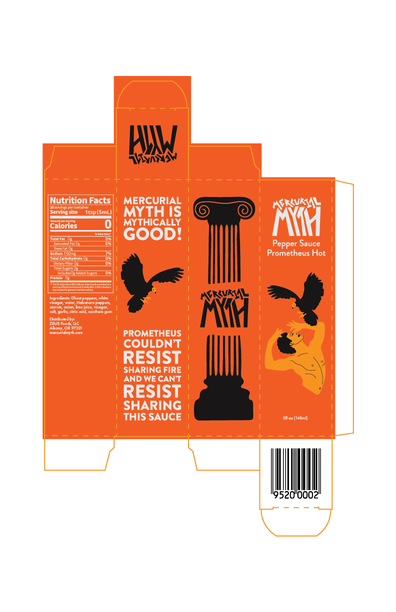
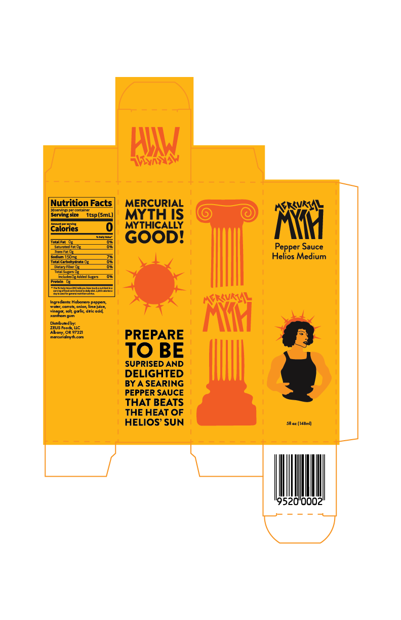
I created packaging for three types of pepper sauce, ranging from mild to spicy. Each plays off of a different Greek myth.
Prometheus was punished for bringing fire to humans - chained to a rock for all eternity, his liver eaten by vultures only to be regrown every day to repeat the cycle. I imagined “Prometheus Hot” as a “deadly” spicy heat
Helios is the god of the sun, which, as we all can imagine, is pretty darn hot, but usually not deadly, so I imagined packaging inspired by him as “Helios Medium.”
Lastly, Hestia is the goddess of the hearth. There is a heartier, kinder heat to her role, so I imagined the packaging with her on it as “Hestia Mild.“