❋
Motorola
Branding Design
2025
Tools
Illustrator and Photoshop
Skills
Layout, Art Direction, Photo-Editing, Branding
This project faced one central issue: Motorola's current external brand perception differs significantly from their actual products and services, as well as their main consumer base: low-income Gen Z.
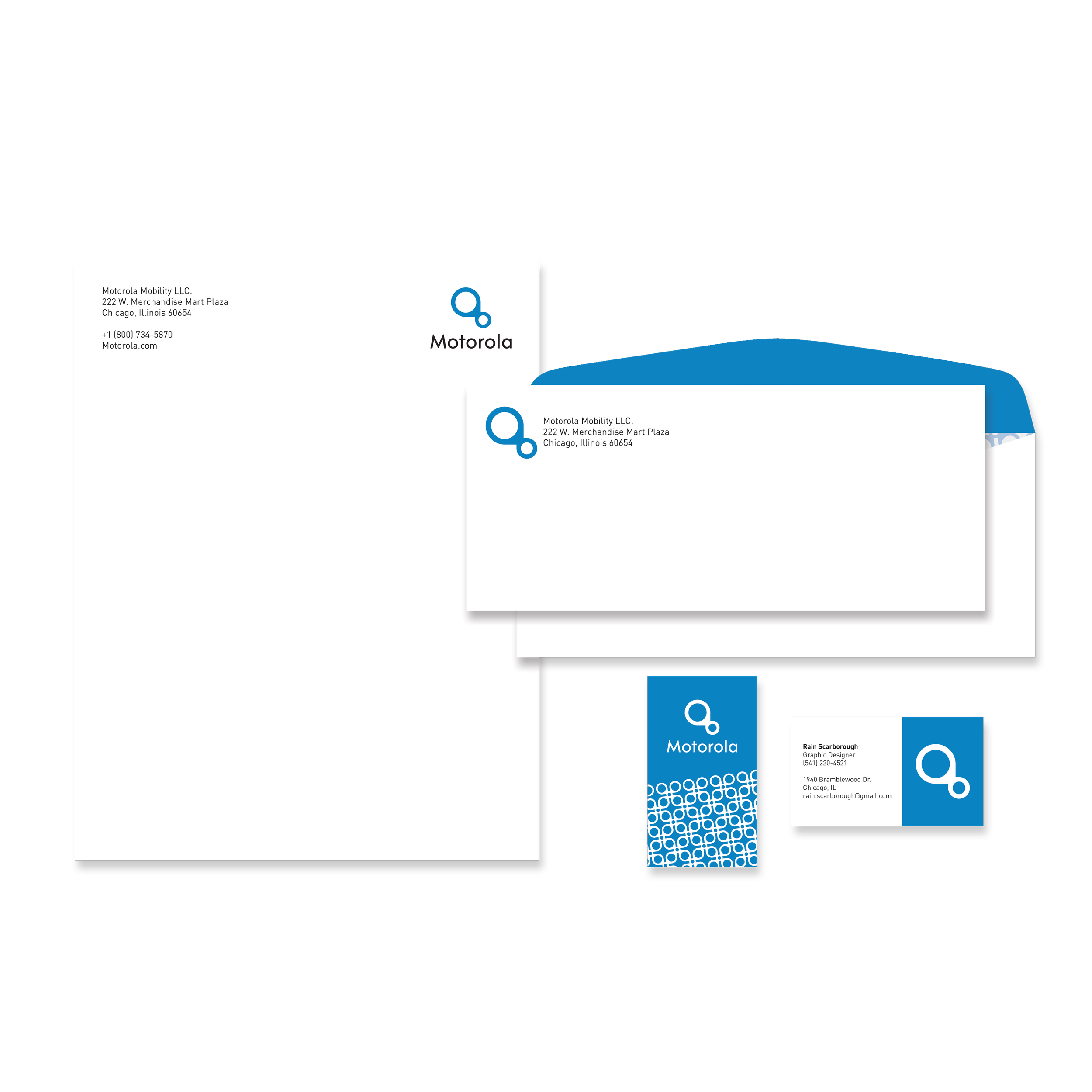
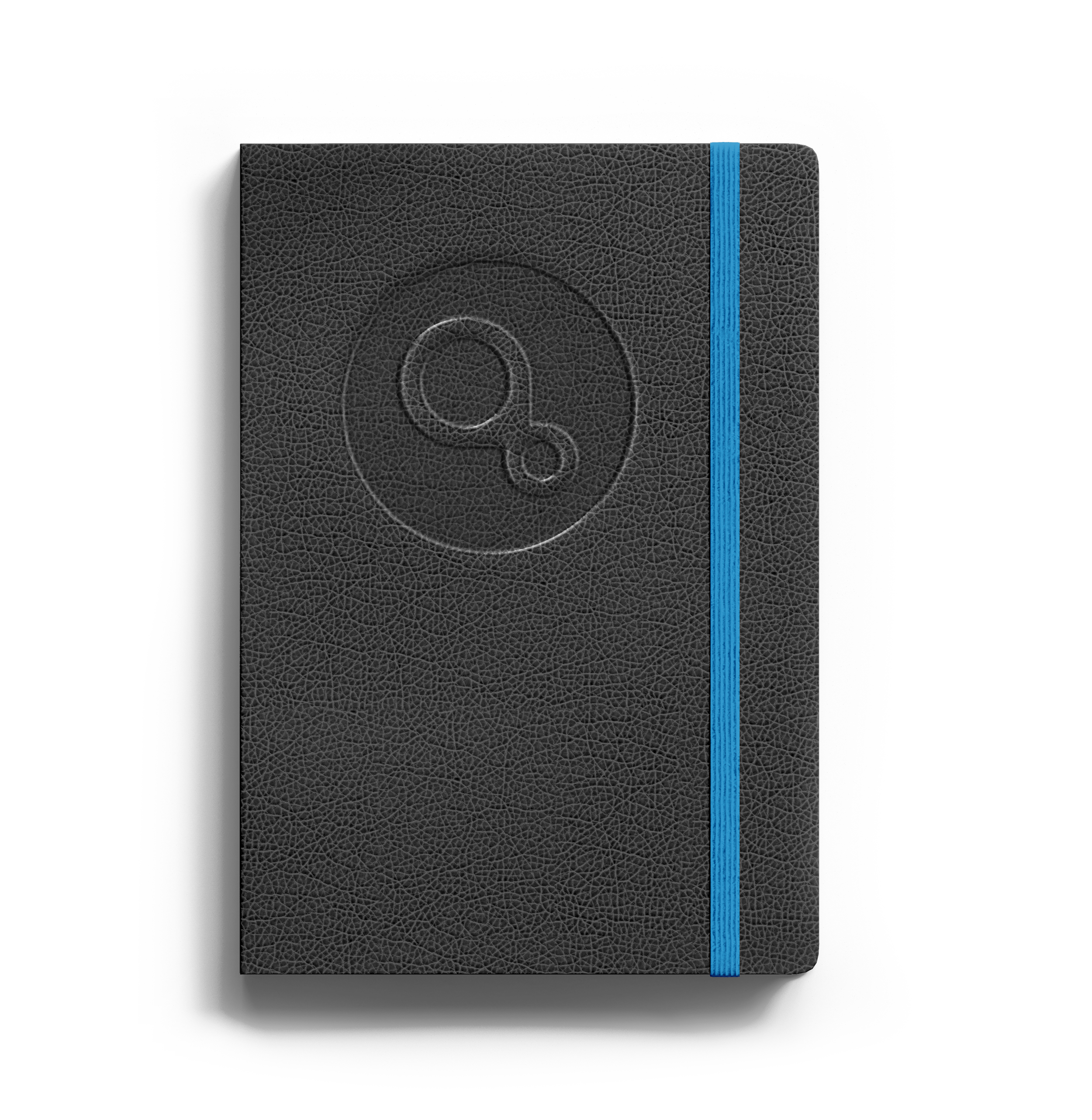
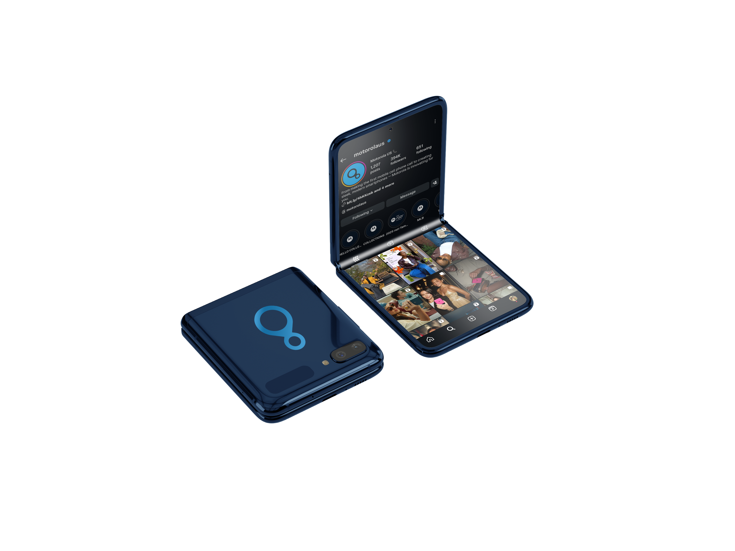
This rebrand explores how Motorola could address that disconnect through branding. Bright colors and modern, youthful graphics and imagery better connect to their primary consumer.
The new logo centers around their core value of connection.
Process
〰️
Process 〰️
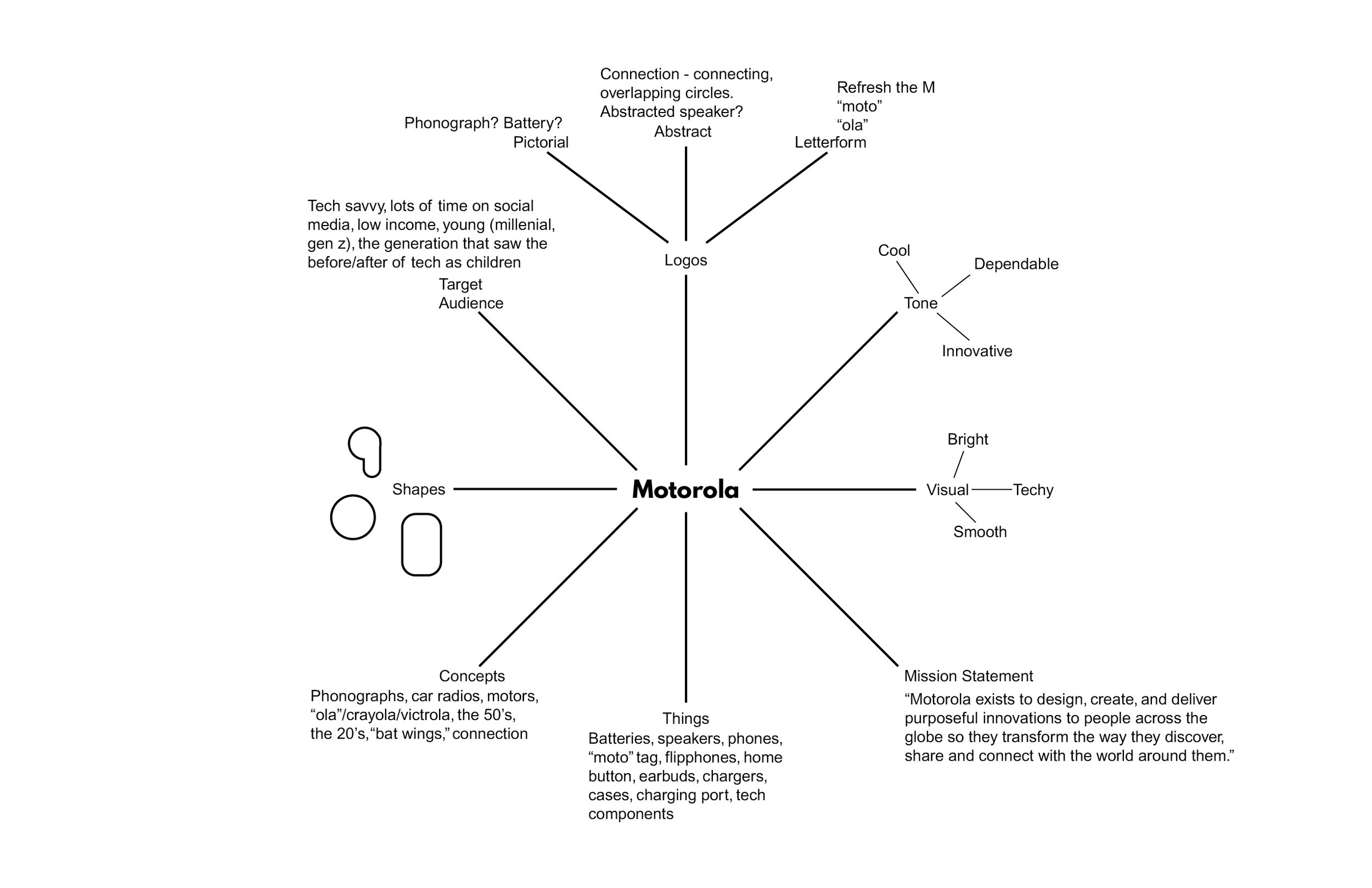
I began with a mind map.
For this project, I generated ideas along specific areas -- tone, visuals, mission statements, things, concepts, shapes, the target audience, and logo ideas along pictorials, abstracts, and letterforms.
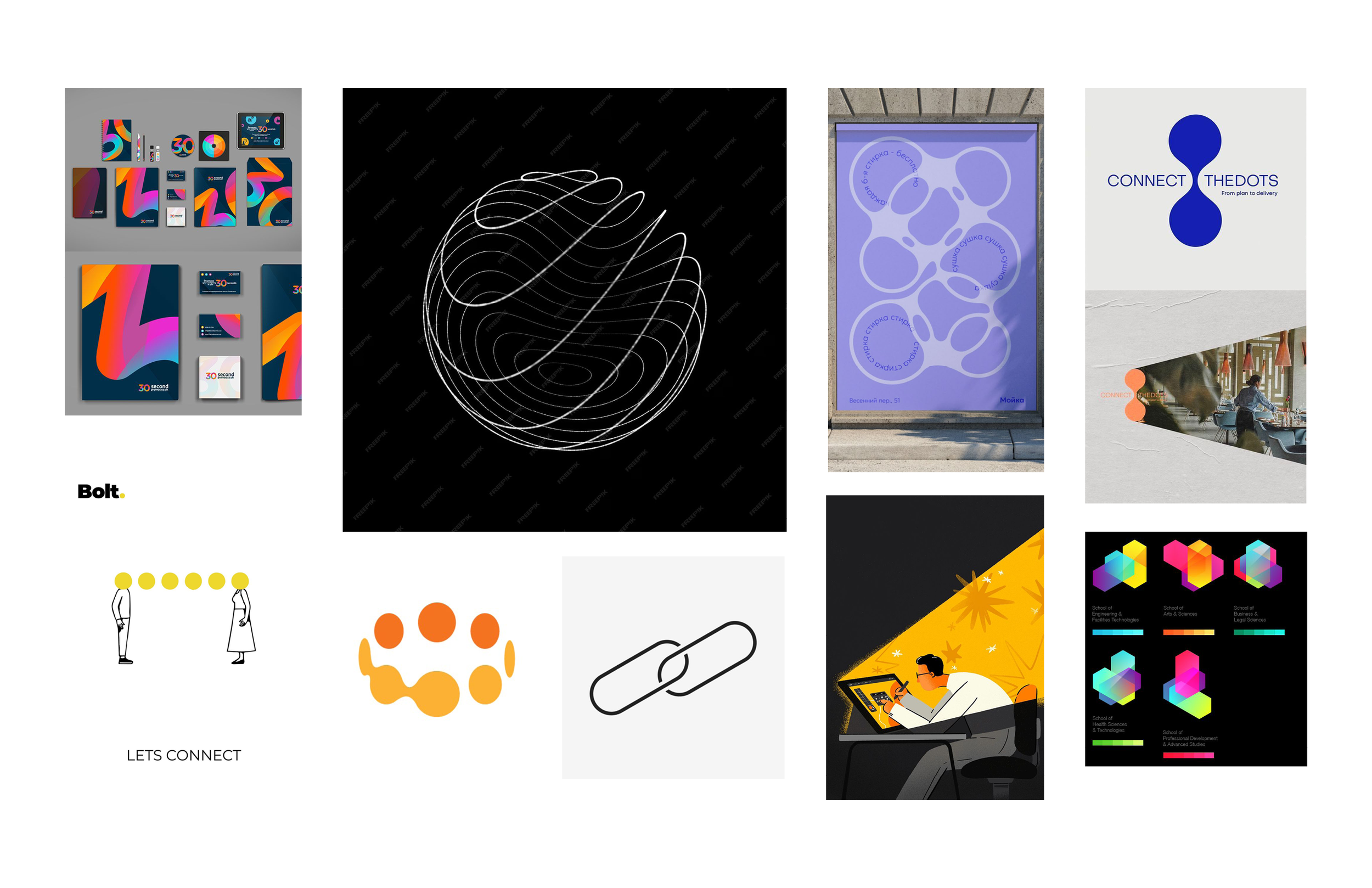
Next, I created a mood board for the project — focusing on tones and visuals I’d been thinking about.
I knew connection was going to be something I really wanted to focus on, so many of the shapes I was drawn to leaned in to that.
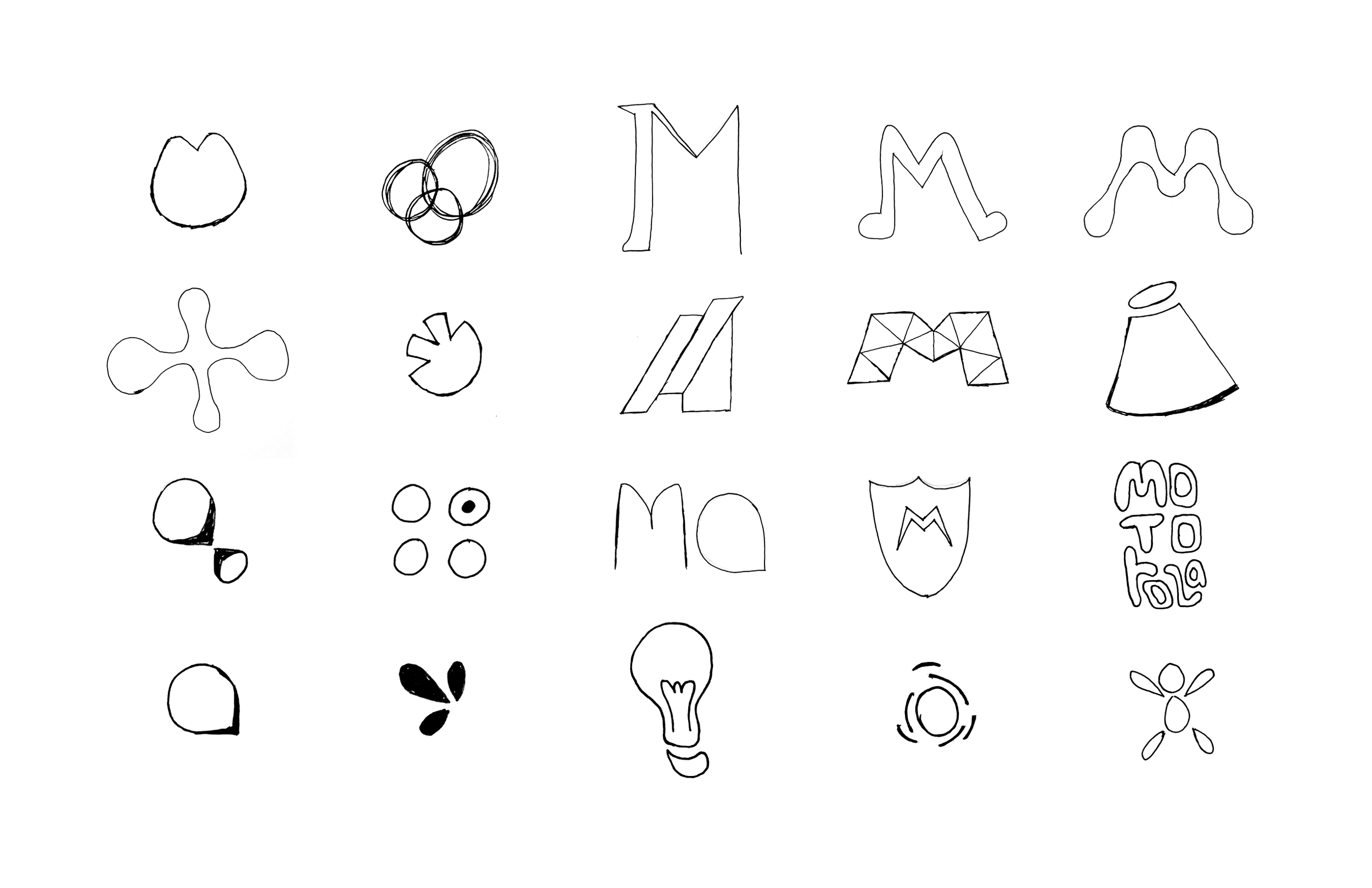
The third part of my initial exploration was sketching out logo possibilities.
I considered refreshing the Motorola M, or using pictorials or abstracts that connected through ideas of connection, brightness, or innovation.